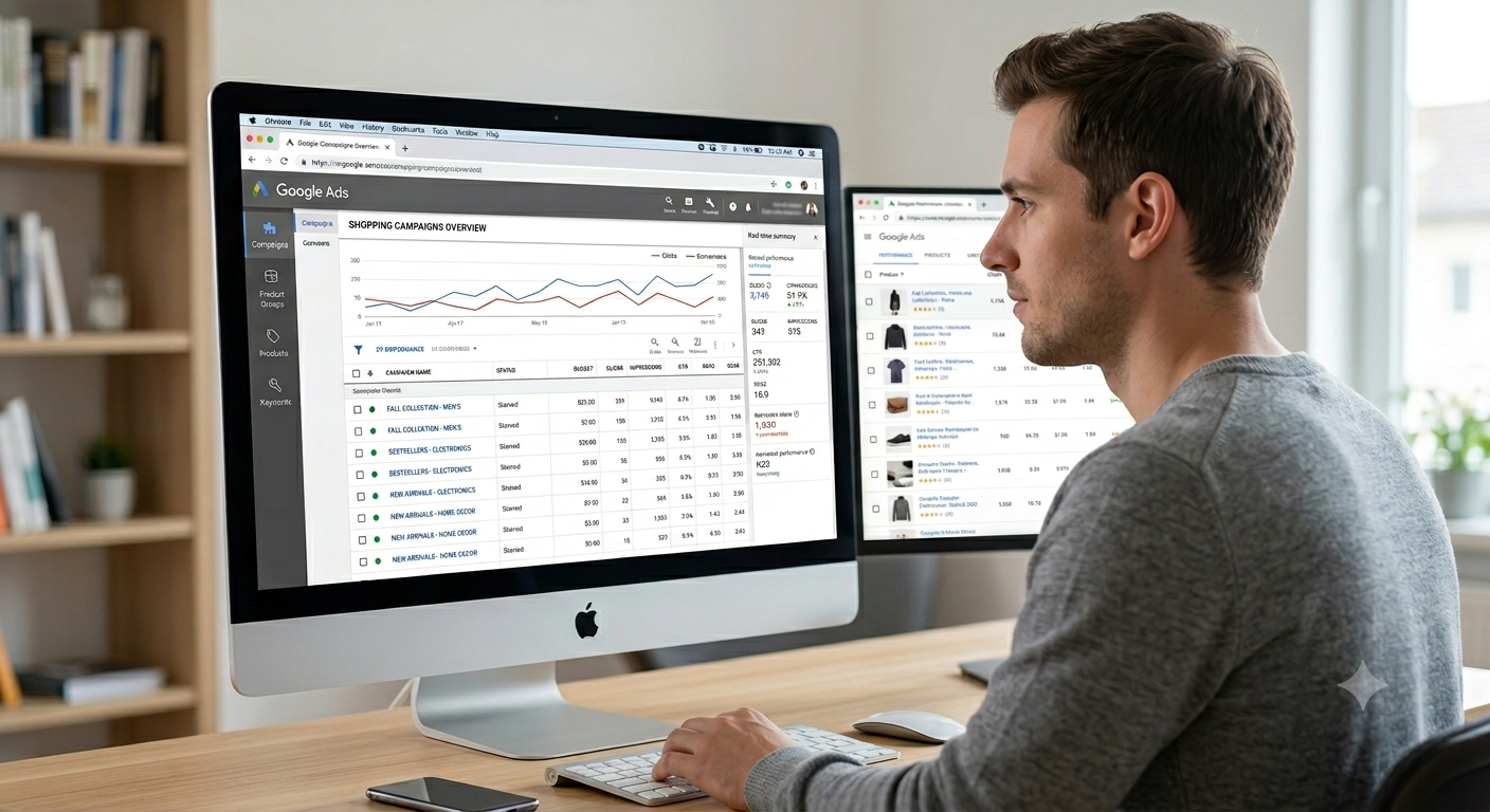
CRO in 2026: The Basics That Still Win (And the Fixes Most Sites Still Haven’t Made)
Conversion rate optimisation has a reputation for being complicated. Split tests, heatmaps, multivariate experiments, statistical significance — it can sound like something that only enterprise brands with dedicated teams and six-figure tool budgets get to do properly.
But here’s the thing. Most websites aren’t losing conversions because they lack a sophisticated testing programme. They’re losing them because of basic, fixable problems that have been sitting there for months, quietly turning away people who were genuinely ready to buy, enquire or sign up.
This post is about those problems. The form that asks for too much. The CTA that blends into the page. The checkout that makes people think twice at exactly the wrong moment. The user journey that loses people somewhere between landing and converting, and nobody’s quite sure where.
Fix the basics and you’ll see results. It’s not glamorous advice, but in 2026 it’s still the truest thing anyone can tell you about CRO.
Start With a Conversion Audit — Before You Change Anything
The most common CRO mistake isn’t making the wrong changes. It’s making changes without knowing what’s actually broken. Gut instinct is useful, but it’s also frequently wrong, and redesigning a button colour because it felt like the right call is not a strategy.
A conversion audit gives you a clear picture of where people are dropping off, what they’re doing before they leave and which pages are quietly underperforming despite decent traffic. It doesn’t have to be complicated. It just has to be done before anything else.
“You can’t optimise what you haven’t measured. The conversion audit isn’t the boring part — it’s the part that tells you where to look.”
What a basic conversion audit covers:
- Google Analytics 4 funnel reports — where in the journey are people dropping off and at what rate
- Landing page conversion rates broken down by traffic source — organic, paid and direct often behave very differently
- Heatmaps on your highest-traffic pages — where are people clicking, where are they stopping, what are they ignoring
- Session recordings — watch real users navigate your site, especially on mobile, and look for hesitation, rage clicks and dead ends
- Form abandonment data — what percentage of people start a form and don’t finish it
- Exit pages — which pages are people leaving from most frequently, and why
The goal of the conversion audit isn’t to find everything at once. It’s to identify your highest-impact opportunities — the pages with significant traffic and poor conversion rates — and work on those first. That’s where your time will return the most.
Form Friction: The Silent Conversion Killer
Forms are where more conversions die than anywhere else on most websites. Not because people don’t want to get in touch, buy the product or sign up for the thing — but because the form makes it harder than it needs to be.
Every unnecessary field is a reason to give up. Every vague label is a moment of confusion. Every form that submits and then displays an error message at the top — after the person has scrolled down to fill it in — is a tiny act of hostility dressed up as a user interface.
“People don’t abandon forms because they changed their mind. They abandon them because the form made them work too hard.”
The form friction fixes that move the needle:
- Remove every field that isn’t essential — if you don’t need their company name to send a quote, don’t ask for it
- Use inline validation so people know immediately if something’s wrong, not after they’ve hit submit
- Add placeholder text and helper copy to fields that might be confusing — a phone number field that says “We’ll only call if your query needs it” removes a common hesitation
- Make error messages specific — “please enter a valid email” is more useful than “error in field 3”
- On multi-step forms, show a progress indicator — people are more likely to complete something when they can see how far they’ve come
- Autofill should work — if your form fights browser autofill, you’re adding unnecessary friction for mobile users especially
- On mobile, trigger the right keyboard for each field type — a number pad for phone numbers, an email keyboard for email addresses
The goal is to make the form feel effortless. Every second of friction between intent and completion is a conversion you might not get back.
Mini Case Study: The Enquiry Form That Was Asking Too Much
A trades business in the home services sector was getting solid traffic to their contact page — around 400 visits a month from a mix of paid and organic sources — but the enquiry form was converting at just under 3%. The form had seven fields: name, email, phone, address, job type, preferred start date and a free-text message box.
After a session recording review, it was clear that most users were filling in the first three fields and then stopping when they hit the address field. Many people were browsing for a quote before they’d committed to a decision, and being asked for their home address felt premature.
The form was reduced to four fields: name, email, phone number and a brief description of the job. The address field was moved to a follow-up call. The conversion rate moved from 2.8% to 6.4% within the first three weeks — more than doubling enquiry volume on the same traffic.
The job wasn’t to be clever. It was to get out of the way.

Trust Signals: What Makes People Feel Safe Enough to Act
People don’t convert on websites they don’t trust. That sounds obvious but the implications are easy to underestimate. A visitor who’s landed on your page for the first time has no prior relationship with you. They’re making a rapid, often subconscious assessment of whether you’re credible, safe and worth their time — and they’re doing it in seconds.
Trust signals are the elements of your page that answer the question “is this legit?” before the visitor has even consciously asked it. Get them right and people move through your site with confidence. Get them wrong — or leave them out altogether — and you’ll see high bounce rates and low conversion rates with no obvious explanation.
“Most conversion rate problems aren’t about the offer. They’re about whether the visitor trusts the person making it.”
The trust signals worth prioritising:
- Real customer reviews with names, photos where possible and specific detail — “great service” is less convincing than “got a quote within an hour and the work was done by Thursday”
- Star ratings visible on the page, not just on a separate reviews tab
- Industry accreditations, certifications and professional memberships displayed prominently — not buried in the footer
- Security badges near payment fields and form submit buttons — people notice their absence more than their presence
- A clear, easy-to-find returns or refund policy — especially for ecommerce
- Real contact details: a phone number, a physical address if relevant, a named person behind the business
- Case studies and before-and-after results that show rather than tell
Trust signals work best when they appear at the point of hesitation — near the form, near the price, near the checkout button. That’s where doubt tends to surface, and that’s where reassurance needs to be waiting.
CTA Hierarchy: When Everything’s Important, Nothing Is
A CTA problem is often a CTA hierarchy problem. There are too many competing options, no clear visual priority and the visitor ends up hovering, uncertain of what they’re supposed to do next.
Every page should have one primary CTA — the thing you most want the visitor to do — and everything else should support it, not compete with it. That doesn’t mean you can’t have secondary options, but they should look and feel secondary. A ghost button or a text link sits clearly below a solid, high-contrast primary button in the visual hierarchy, and that distinction matters more than most people give it credit for.
Getting CTA hierarchy right:
- One primary CTA per page — make it obvious, make it action-led and make it contrast with the page
- Use specific, benefit-led CTA copy rather than generic phrases — “Get My Free Audit” converts better than “Submit”, “Start Saving on Ads” beats “Learn More”
- Position your primary CTA above the fold and repeat it after key sections of content — people who’ve read a persuasive paragraph are more ready to act than they were at the top of the page
- Avoid CTA clusters — three equally prominent buttons in a row create paralysis, not action
- Test button colour against your page background — contrast matters more than brand consistency when it comes to click rate
- On mobile, your CTA needs to be thumb-friendly in size and not obscured by chat widgets, cookie banners or sticky headers
The CTA is the moment of conversion. Everything on the page should be pointing toward it.
User Journey Fixes: Mapping Where People Actually Go
Most websites are designed around how the business thinks users will behave, not how they actually do. The homepage leads logically to the services page, which leads to the contact form, which leads to a thank you page. Neat and rational. Also frequently not what happens.
Real users arrive on blog posts, bounce between pages, return days later from a different device and sometimes convert on a page that wasn’t designed to convert at all. Understanding the actual user journey — not the intended one — is where a lot of hidden conversion opportunity sits.
“The intended user journey and the actual user journey are almost never the same thing. The gap between them is where CRO lives.”
User journey fixes to explore:
- Use GA4 path exploration reports to see the actual routes people take through your site — you’ll often find unexpected patterns
- Identify your most common entry pages outside the homepage and make sure they have a clear next step — not just a menu
- Add contextual CTAs within blog content — someone reading a post about ad performance is a warm lead; give them somewhere to go
- Check your mobile journey separately from desktop — the experience is often dramatically different and the problems are usually different too
- Look at your thank you pages — most say “thanks, we’ll be in touch” and nothing else; this is a missed opportunity to upsell, gather more information or set expectations
Every page a person visits is a step in a journey. Make sure each one moves them forward rather than leaving them to figure out the next step themselves.
Mini Case Study: The Thank You Page That Started Working
An ecommerce brand selling premium skincare products was running Meta ad campaigns to a product landing page and seeing reasonable conversion rates — around 3.1% on cold traffic, which was acceptable. But post-purchase behaviour was almost non-existent. Repeat purchase rates were low and there was no meaningful engagement after the first order.
The thank you page was a standard confirmation: order number, expected delivery date, a “continue shopping” link that went to the homepage. Nothing else.
A revised thank you page was tested that included: a personalised product recommendation based on what had just been purchased, a 15% discount code for their next order valid for seven days, a short explanation of what to expect from the product in the first two weeks and a prompt to join a private customer community.
Within six weeks, repeat purchase rate from first-time customers increased by 22%. The thank you page had never been seen as part of the conversion process. It turned out to be one of the highest-leverage pages on the site.

Testing Ideas: Where to Start When You Don’t Know Where to Start
CRO testing doesn’t require a sophisticated platform or a data science team. It requires a clear hypothesis, a fair test and enough traffic to reach a meaningful result. Start with the changes most likely to have an impact and build from there.
Testing ideas worth prioritising in 2026:
- Test your headline — it’s the first thing people read and the biggest single influencer of whether they stay
- Test the number of fields in your forms — fewer almost always wins, but test it for your audience
- Test CTA copy — action-specific beats generic every time, but which action resonates most is worth finding out
- Test social proof placement — reviews above the fold versus below the CTA versus both
- Test your page load speed — a faster page is always worth testing against a slower one
- Test long-form versus short-form landing pages — for higher-consideration purchases, more information often converts better
One test at a time. Give each test enough time to reach statistical significance before drawing conclusions. And document everything — the tests that don’t win are just as useful as the ones that do.
Measurement: The Part That Makes Everything Else Matter
None of this works without proper measurement in place. If your conversion tracking is incomplete, your GA4 setup is inconsistent or your thank you page confirmation isn’t firing reliably, you’re making decisions based on incomplete or inaccurate data — and optimising in the wrong direction.
The measurement basics that need to be right:
- GA4 conversion events set up for every meaningful action: form submissions, purchases, phone clicks, email clicks and scroll depth on key pages
- Google Tag Manager in place so tracking changes can be made without developer involvement every time
- Heatmap and session recording tools running on your highest-traffic pages — Microsoft Clarity is free and more than good enough for most sites
- A/B testing recorded with start dates, variants and results in a shared document — not just in someone’s head
- Monthly conversion rate reviews by page and by traffic source — a conversion rate problem that’s specific to paid traffic is a different problem to one that’s site-wide
Good measurement doesn’t just tell you what’s working. It tells you what to try next.
The Bottom Line
CRO in 2026 isn’t about finding a silver bullet fix that doubles your conversion rate overnight. It’s about finding the friction, the confusion, the missing trust signals and the broken user journeys — and fixing them, one at a time, with evidence rather than guesswork.
Start with the conversion audit. Fix the forms. Add the trust signals where they’re needed. Clarify the CTAs. Map the actual user journey. Test things. Measure everything.
It’s not complicated. It’s just consistent — and consistency is what separates the sites that improve over time from the ones that stay stuck wondering why the traffic isn’t converting.
Recent Posts


